I’m sure that I’ll get bad-mouthed for posting this, why bother, right? Well, there is a very telling indicator why Hollywood Films are so bad. There’s absolutely no originality in Tinsel Town. For instance, let’s take One-Sheets (Movie Posters.) Now, I *love* One-Sheets and have some from the 50’s. They’re awesome. But now days, not so much. So, it’s time for show and tell! The following is just how little creativity there really is at the Studios. For your approval, I give you the 15 Over-Used Movie Poster Clichés. http://www.dailyinspiration.nl/has-hollywood-lost-its-creativity/
Do you ever feel like you’re seeing the same movie poster again and again? You probably are. They just recycle these designs:
If your film is a “big independent film” then go with that really loud yellow. This shows you’re a true maverick!
A romantic comedy? Heck, have the Woman wear a red dress!
For the ultra-dramatic back-shot, how about the tried and true lonely hero/vigilante silhouette? Bonus points for bad-assery if he’s wearing a hat!
Got a horror flick that you want to scare the bejesus out of audience with? Then use the huge, looming eye as the go-to movie poster. Ooooooh, scary!!!
Animals movie posters always use dark blue and have some thin, white text in capital letter. They’re typically seen in a profile shot or from the back. Don’t forget to put in a huge white moon too!
What if your Film is about Justice and Law? Use the blindfold dude!
It’s a Tom Cruise picture? No problem. A side shot of him. He’s got a great profile!
A simple one, if your actors are brave and heroic then super impose text.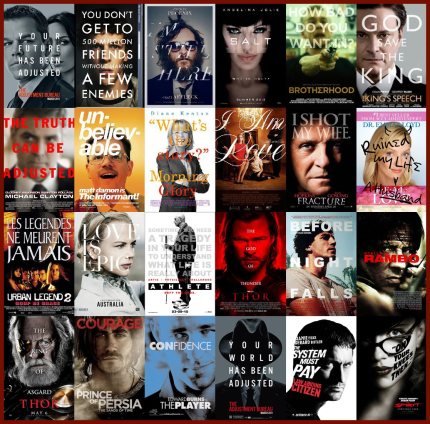
Okay, what about a tough-love relationship? Piece of cake, just have them standing back to back!
If your movie is really poignant and touching then just use the silhouette in front of the ocean while faces float in the clouds. Make sure to invoke those pastels too.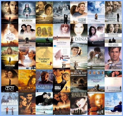
If you see a black and white poster with a flaming red blasting out then you can bet it’s an action flick. Expect at the very least…5 explosions.
But if it’s comic book-like, then use a high style with a weaponry focus combining black and white with red block text. Much more effective!
The standard person running down the middle of a street should more than likely be blue. And it’s a safe bet that it’s a a thriller type of movie as well.
Now don’t be hating on me because I’m a bit partial to this one. The poster is dominated by faces created out of elements of the film.
And last but not least, SEX!!! Put some shapely, female legs spread in an upside down V and put your protagonist standing under them. Or staring at them. Point your guns at the bad guys through them. A myriad of gorgeous gams, just look at the endless possibilities!
So, why are Hollywood films are so bad?
